HTML and CSS Reference
In-Depth Information
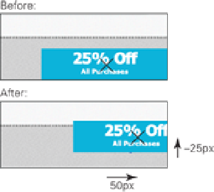
By using the
translate()
function to position the center of the banner here, you can then rotate it to be perfectly
positioned in the way the image was.
Figure 12-3
The origin of the banner advertisement and how it is used to calculate the banner's new position.
You can give the
translate()
function any unit of length or a percentage as its values. If the second value, rep-
resenting the Y axis, is absent, it is assumed to be
0
.
translate()
is the shorthand function for
translateX()
and
translateY()
, which change the X and Y
axis, respectively.
rotate()
If you're itching to get to it, you can rotate that banner straight away and then take a closer look at the
rotate()
function:
1.
In styles.css, change the
transform
declaration in the
.banner-ad
rule set to include a
rotate()
function:
-webkit-transform: translate(50px, -25px) rotate(-45deg);
2.
Save styles.css.
As shown in Figure 12-4, the banner is now rotated and appears in the same way that the image did. Why go to that
effort? Although the element is still square after you rotate it, the diagonal top of the banner is now the top of the ele-
ment, so there is no invisible space, as there was with the image. What's more, in Chapter 14, you take this process
further and animate the banner when it's hovered over.
Figure 12-4
The banner advertisement rotated to sit at -45 degrees in the corner of the viewport.


