HTML and CSS Reference
In-Depth Information
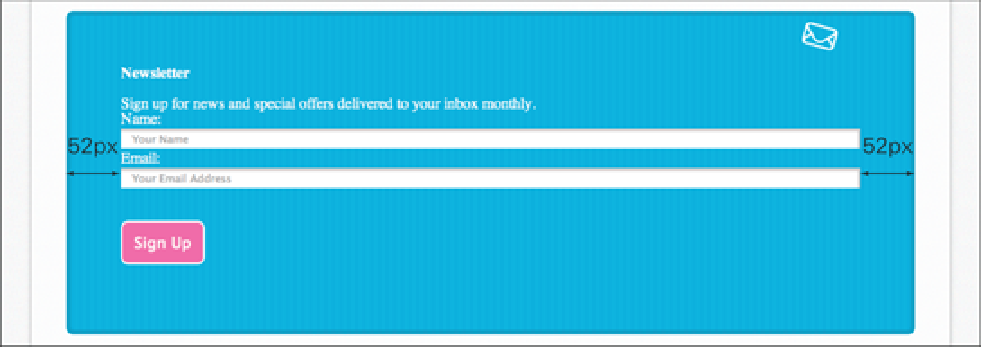
Figure 7-10
The input fields are centered now the box-sizing has been changed to border-box.
You may remember
content-box
and
border-box
from the
background-clip
and
background-ori-
gin
definitions in Chapter 5. You may also remember a third value those properties accepted, called
padding-
box
, which at present is included in the CSS3 User Interface Module, where
box-sizing
is described
padding-box
works in a similar way to
border-box
. Where
border-box
draws a border and padding inside
the specified width and height of an element,
padding-box
draws the padding only on the inside and the border
remains on the outside. I'm not sure why you would choose this property over the original box model
content-
box
(because it's just as unintuitive to start with, if not more so) or the newer and easier to use
border-box
. This
is obviously an opinion shared by browser vendors and the W3C, too, because not all browser vendors have imple-
mented
padding-box,
and the W3C has suggested
padding-box
might be removed from the specification in
the future.
Summary
In this chapter, you learned about the mysterious box model—the way in which browsers determine the layout of
elements. The box model is an important concept to understand if you really want to achieve well-laid-out pages that
can not only change in size based on the device a page is being viewed on but will also remain robust and modular as
you continue building and styling a page. As you saw in the code challenges, a page will often have many
padding
and
margin
properties applied to it. Spending a little extra time carefully considering
padding
and
margin
dur-
ing the layout stage can often save you a lot of time in the future.
With this knowledge under your belt, you're close to completing the layout of the Cool Shoes & Socks page. In the
next chapter, you learn to make elements “float” next to each other, creating a multicolumn layout.