HTML and CSS Reference
In-Depth Information
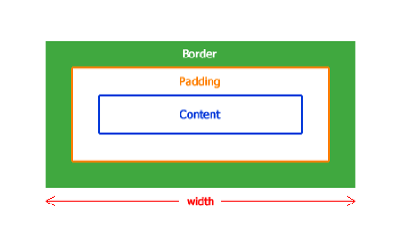
Figure 7-8
The way the areas of the box model are laid out when the box-sizing is border-box.
So, if the newsletter box has a specified width of 100%, you don't have to work around the centering issues you saw.
These styles caused the newsletter box to appear bigger than the width of the page:
#newsletter {
color: white;
border-radius: 8px;
border: rgba(0,0,0,0.1) solid
5px
;
background:
url(“../images/icon-newsletter.png”) no-repeat 91% 2%,
url(“../images/bg-newsletter.png”) repeat 0 #00ACDF;
padding:
6%
;
width: 100%;
}
If you were to give the
#newsletter
rule set the declaration
box-sizing: border-box;
, the browser
would make the newsletter box 100% and then apply the padding and border inside that, meaning the newsletter box
wouldn't get any bigger than the defined 100%. Woohoo! Such a simple property makes working with the box model
so much easier. No more math!
Again,
box-sizing
isn't supported in Internet Explorer 6 and 7, so you should use it only if you're not supporting
those browsers or use it on noncritical styles. Now add a noncritical style to the page and make use of
box-siz-
ing: border-box
in doing so:
1.
In styles.css, find the rule set for
input[type=”text”], input[type=”email”]
and add the fol-
lowing:
width: 100%;
2.
Save styles.css.