HTML and CSS Reference
In-Depth Information
The Pitfall of the Box Model and Working Around It
In the definition of the
padding
property, I mentioned the box model can sometimes be harder to work with than it
needs to be. Let's take a deeper look at this issue so you can avoid any confusion in the future, or if you are in the
fortunate position of not needing to support anything but modern browsers, a way around these difficulties altogeth-
er.
When creating a page, you may decide to declare that an element should have a width of 100%. Do that now for the
newsletter box:
1.
In styles.css, find the
#newsletter
rule set and add the following:
width: 100%;
2.
Save styles.css.
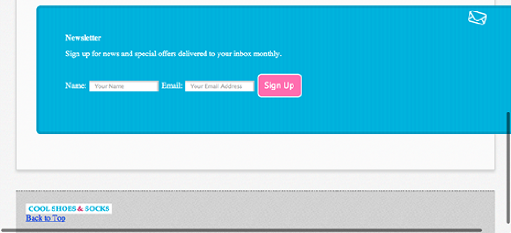
As shown in Figure 7-5, the newsletter box has a width greater than 100%, even though you told it to be 100%!
Figure 7-5
The newsletter extends beyond the boundaries of the page.
The reason is that, by default, the width of an element is applied only to the content area. The
#newsletter
rule
set declares that the newsletter box should have a border width of 5px, a padding of 6%, and a width of 100%:
#newsletter {
color: white;
border-radius: 8px;
border: rgba(0,0,0,0.1) solid
5px;
background:
url(“../images/icon-newsletter.png”) no-repeat 91% 2%,
url(“../images/bg-newsletter.png”) repeat 0 #00ACDF;
padding:
6%
;
width: 100%;