HTML and CSS Reference
In-Depth Information
Note that if you want to use multiple background images, as with the other background properties, you can separate
multiple
background-clip
properties with a comma.
background-origin
Initial value:
padding-box
| Inherited: No | Applies to: All | CSS3
Browser support: IE 9+, Firefox 4+, Chrome 1+, Opera 10.5+, Safari 3+
In Figure 5-19, you may have noticed the newsletter icon disappeared. With a declaration of
background-clip:
content-box
, the icon was positioned outside the content area and got clipped.
background-origin
allows
you to change the background positioning area.
In Figure 5-20, I changed the
background-clip
back to
border-box
and gave it a
background-posi-
tion
of
92% 0
. As you can see, the newsletter icon still sits 92% to the right of the box but starts perfectly where
the padding box does—the default value for
background-origin
.
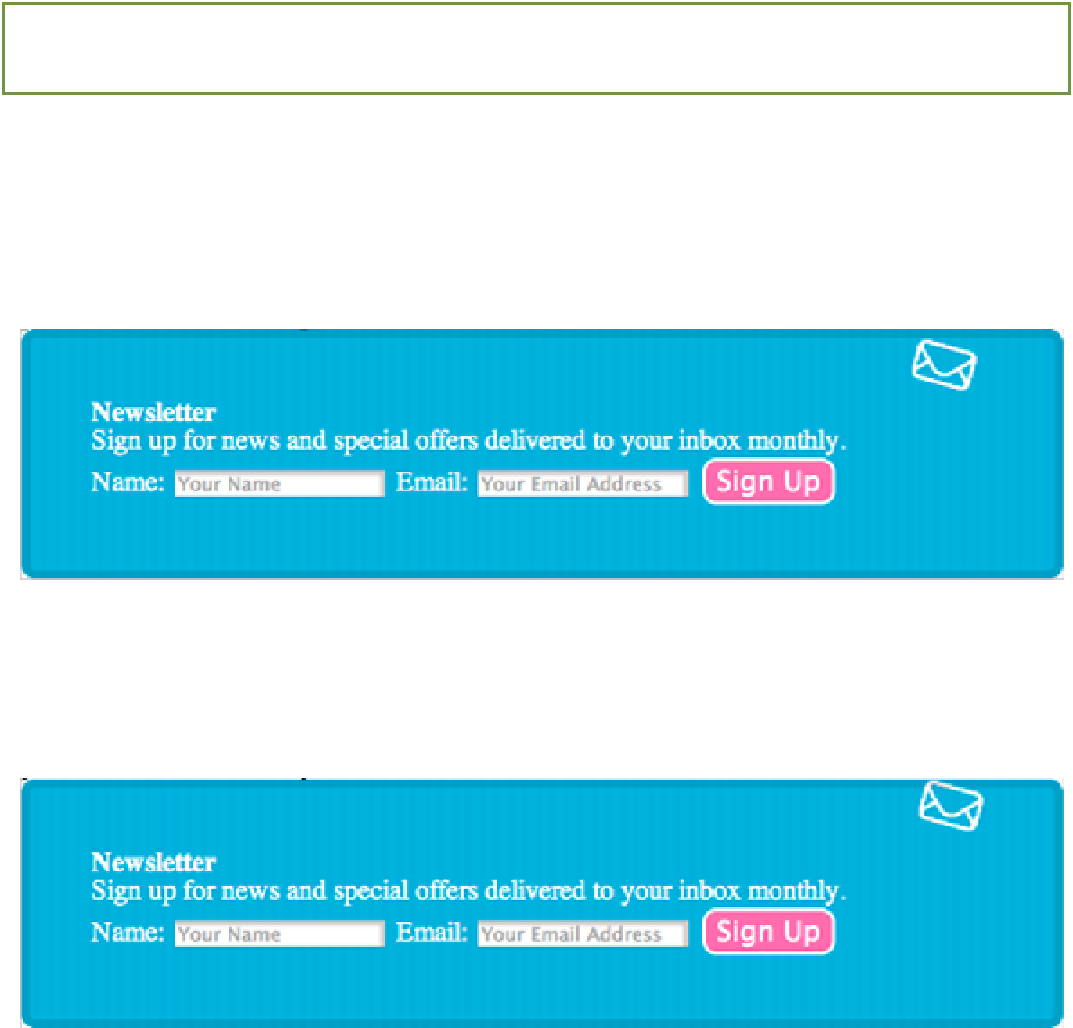
Figure 5-20
The newsletter icon in relation to the newsletter box with a background-clip of border-box and a
background-position of 92% 0.
When you change the
background-origin
to
border-box
, the newsletter icon touches the top of the border,
as shown in Figure 5-21.
Figure 5-21
The newsletter icon in relation to the newsletter box with a background-origin of border-box applied to it.
Can you guess what happens when
background-origin: content-box
is applied? The position of the
newsletter icon starts within the content area, as shown in Figure 5-22.