Image Processing Reference
In-Depth Information
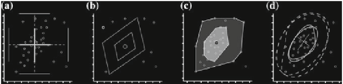
Fig. 1.3
Bivariate extensions of the boxplot.
a
The rangefinder boxplot [
3
].
b
The 2D boxplot [
99
].
c
The bagplot [
88
].
d
The quel-(
gray
)andrel-(
black
) plots [
32
]
extrema value of the variables [
53
]. Other techniques for extending the boxplot into
2D all use the notion of a hinge that encompasses 50 % of the data and a fence that
separates the central data from potential outliers. The distinctions between each of
these methods are the way the contour of the hinge and fence are represented, and
the methods used to calculate the contours. The 2D boxplot [
99
], as seen in Fig.
1.3
b,
computes a robust line through the data by dividing the data into three partitions,
finding the median value of the two outer partitions, and using these points as the
line. Depending on the relationship between the slope of the line and each variable,
the quartile and fence lines are drawn either parallel to the robust line, or parallel to
the variables coordinate axis. The lines not comprising the outer-fence and the inner-
hinge boxes are removed. The bagplot [
88
] uses the concept of halfspace depth to
construct a bivariate version of the boxplot, as seen in Fig.
1.3
c. The relplot and
the quelplot [
32
] use concentric ellipses to delineate between the hinge and fence
regions. Both the relplot and quelplot can be seen in Fig.
1.3
d.
1.5.1.3 PDFs
There is a body of research investigating methods for displaying probability distri-
bution functions with spatial positions. Each of these methods takes an exploratory
approach to the presentation of the data by filtering down the amount of data, and
then providing a user interface for the scientist to explore the data sets. Ehlschlaeger
et al. [
25
] present a method to smoothly animate between realizations of surface
elevation. Bordoloi et al. [
7
] use clustering techniques to reduce the amount of data,
while providing ways to find features of the data sets such as outliers. Streamlines
and volume rendering have been used by Luo et al. [
61
] to show distributions mapped
over two or three dimensions.
Kao et al. [
48
] uses a slicing approach to show spatially varying distribution data.
This approach is interesting in that a colormapped plane shows the mean of the
PDFs, and cutting planes along two edges allow for the interactive exploration of
the distributions. Displaced surfaces as well as isosurfaces are used to enhance the
understanding of the density of the PDFs.
Search WWH ::

Custom Search