Image Processing Reference
In-Depth Information
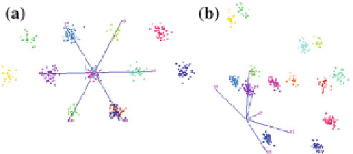
Fig. 16.3
Visual encoding of clustering result using color after projection into a 2D visual space.
Comparison of projections into standard star coordinates (
left
) and optimized star coordinates (
right
).
The optimized star coordinates minimize the overlap of projected clusters
scaling, and order of the axes are optimized by the derived projection. Displaying
the projected clusters in this optimized star coordinates plot allows for relating the
clusters to the original attribute dimensions. Figure
16.3
shows the projection of a
six-dimensional data set into optimized star coordinates and compares the projection
to standard star coordinates (with optimal permutation of the coordinate axes) [
20
].
The clusters are visually encoded in the projection by using color. The optimized star
coordinates achieve to keep all clusters separated, while the standard star coordinates
fail to do so. This can also be quantified using the distance consistency measure intro-
duced by Sips et al. [
35
]: The standard star coordinates achieved a value of 82
.
71,
while the optimized star coordinates has the optimal value of 100.
16.4.4 Parallel Coordinates
A common approach to visualize multi-dimensional data visualization is the use
of parallel coordinates plots. When compared to projected views, parallel coordi-
nates plots have the advantage that the attribute values can be visually retrieved in
a non-ambiguous way. Moreover, correlations between attributes can be observed.
However, the latter is subject to an appropriate ordering of the attribute dimensions
in the parallel coordinates plot. While parallel coordinates plots scale well in the
number of attribute dimensions (when compared to other techniques), one of the
main drawbacks of parallel coordinates plots is that they do not scale so well in
the number of samples. While scatter plots still work for large number of samples,
parallel coordinates plots tend to suffer from visual clutter. Since we are typically
dealing with many samples in the context of multivariate volume data, it is advis-
able to not display all the individual samples of the clusters, but rather have a more
abstract representation of the clusters. For example, Dobrev et al. [
10
] display a band
(in form of a sequence of quadrilaterals) for each cluster instead of set of polylines.
The opacity of the band reflects the line density of the parallel coordinates plot for
that cluster. Using parallel coordinates plots for the clustering result does not only
Search WWH ::

Custom Search