Agriculture Reference
In-Depth Information
4
3
2
1
1
2
3
4
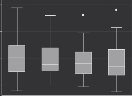
Figure 9.8
Box plots of onion pungency grouped by replications.
Re-create another histogram of the jumbo data and select the Play
button, from which the Histogram Defined.grec file can be selected
and played back. This creates a histogram of jumbo (≥3 in.) onion
yields with the editing changes from the Histogram Defined.grec file.
The next item under the Graphics menu is the Box plot, which con-
structs box plots or what are sometimes called
box
and
whisker
plots.
These simple diagrams offer a wealth of information about the sam-
ple. Select Box plot under the Graphics and construct box plots for
pungency with rep as the grouping variable under Categories. These
are box plots of onion pungency grouped by replications (randomized
complete block design, RCBD) (Figure 9.8). This illustrates the kind
of information presented in this type of graph.
The box represents 50% of the data and is often referred to as the
interquartile range
(IQR). The line in the middle of the box is the
median. The lower and upper edges of the box are the 25% and 75%
quartiles where 25% of data is below this value (25% quartile) or 25%
is above this value (75% quartile). The whiskers represent the upper
and lower range or 1.5 times the IQR above and below the median,
whichever is less. Data points outside this range are marked individu-
ally and are often referred to as outliers. Medians that are near the
bottom edge of the box indicate the data are skewed to the right and
medians near the top of the box are skewed to the left.
The Scatterplot matrix item under the Graphics menu allows you
to look at the relationship between different variables (Figure 9.9).
Search WWH ::

Custom Search