Database Reference
In-Depth Information
What should you use color for? Color can be used to highlight and separate
different series, to show a value along an axis, or as a quick visual cue to show
crossing a threshold.
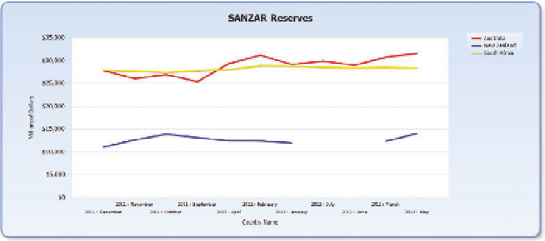
Looking at Figure 2-14, you can see that differentiating between the series is
relatively easy based on the use of colors.
FI g u R e 2-14
Chart contrasting the 3 SANZAR countries' reserves over time
Showing a value along an axis can take many forms, with shapes in forms
such as heat maps, bubble charts, and geo-spatial maps. In all these cases,
the color is used to indicate a value along a range, with the most common
ranges being green
a
yellow
a
red, or blue
a
orange
a
red. Figures 2-15,
2-16, and 2-17 show these different charts.
It is important when choosing these color ranges to make sure that the num-
ber of colors chosen and the values being displayed are congruent. Choosing
a four-color range when there are five different possible values easily leads
to confusion when two disparate values are displayed using the same color.
In the same way, choosing the intervals between the colors is important. Having
one value widely divergent while using an even interval, as in Figure 2-18,
bunches up colors toward one end of the spectrum and possibly hides vari-
ances in the values. Figure 2-18 shows the five European countries with the
highest national reserves, and Switzerland is much higher than the rest, which
can't be distinguished by color.