Database Reference
In-Depth Information
The solution in these examples is to provide a faux 3D transform—keeping
the relationships of the heights to one another identical and distorting the
shape to present a 3D view.
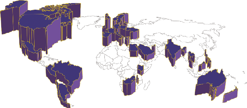
Figure 1-8 is an example of such a graphic on a country map. Note that the
countries are extended vertically rather than in three-dimensional space.
The way the extension of the countries is achieved is through a transform—
essentially each country is the base of a column graph, and as such the height
of the country can be read as the height of a column.
FIguRe 1-8
A prism map illustrating a false 3D projection
If you are using a tool with predefined three-dimensional transforms, I urge
you to hesitate and think through the utility of using them before you apply
them. They often add no value and also easily distort the values presented.
SuMMARy
In this chapter you learned to distinguish by their intended purposes between
a data-driven graphic (a true visualization) and an infographic: visualizations
enable you to discover facts in your data, whereas infographics are designed
to communicate a message.