Database Reference
In-Depth Information
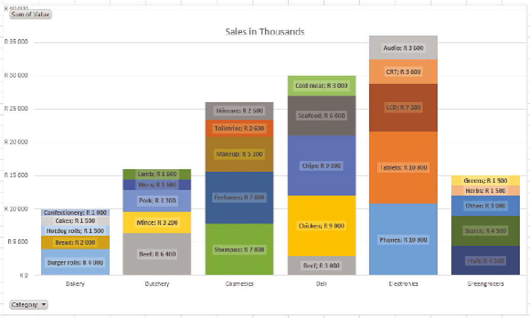
FIguRe 1-4
A stacked bar chart
Although not as flashy, this chart shows it's utility quite quickly: the different
categories can be compared to each other at a glance, while still allowing for
comparisons of the components of the categories. In addition, comparing cakes
and pork in this graph, it is apparent that pork is a much bigger sale amount,
although they are the same percentage of their category. Labels for the actual
amounts have been added in lieu of percentages; either could be used, but
comparing values is more meaningful for cross-category comparisons here.
Now that you have looked at these graphics, you should keep the following
questions in your mind each time you develop a visualization:
uu
Does this visualization contain more data than an equivalently sized table?
uu
Is the data presented in this visualization easier to comprehend than an
equivalent table?
uu
Do the artistic elements add meaning?
uu
Have I added any gratuitous elements that don't add meaning or distract
from the meaning, such as 3D effects, animated transitions, or gratuitous
images?