Database Reference
In-Depth Information
Tool CHoICeS wITH eXAMPleS
Excel, PerformancePoint, and Reporting Services all allow for embedded for-
matting of some description, while Power View does not. Excel is the leader
in this section, with Reporting Services second, and PerformancePoint a long
way behind.
ExCEL
Excel is the most widespread tabular display tool, and as such it has a very
powerful set of visualizations; it is definitely the easiest tool to add embedded
visualizations into. Covering data bars, sparklines, and conditional formatting,
Excel may seem like the first choice in all cases—however there are some
shortcomings.
Excel is great with conditional formatting—as shown in Figure 15-11, it is easy
to add conditional formatting year by year to get a different scale when there
are major data differences.
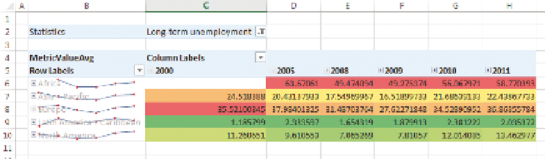
F I g u R e 15 -11
Sparklines combined with conditional formatting in a pivot table
However, when using a sparkline on the same graph, it won't dynamically get
new data as they come in. Compare Figure 15-11 to Figure 15-12: the sparklines
have shown up only for the data points we'd selected.
This same issue occurs with the bullet graph you saw earlier: It was made by
superimposing two bar charts on top of one another, and it does not have
the capability of dynamically resizing. Conditional formatting and indicators
both have the capability of being dynamic, so they are great choices. As shown
in Figure 15-13, Excel provides additional settings for applying conditional
formatting.