Database Reference
In-Depth Information
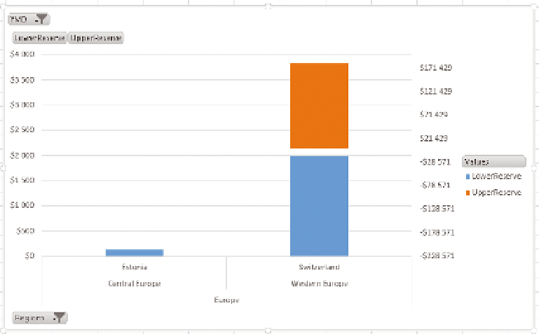
F I g u R e 12 -32
The chart with double scales
It isn't immediately apparent that what we are
doing is a type of scale break technique. To
make that more evident, first hide both axis
titles and add data labels. You can do this by
right-clicking each axis, choosing Format Axis,
and then setting the Label Position to None,
as shown in Figure 12-33.
Add data labels by right-clicking an axis and
choosing Add Data Label. After you've added
the labels, right-click and choose Format Data
Label, set the number format, and also set the
position to Inside End, as in Figure 12-34.
After that, change the font in the Home Ribbon
where you'd normally do it. The final step is
to set a gradient to show that the two series
are related. Using one stop at 15% away and
keeping to the very distinct colors illustrates
that the two sections can't be compared.
Figure 12-35 shows the gradient setup.
F I g u R e 12 -33
Removing labels
from a chart