Database Reference
In-Depth Information
At this point, you see an empty pivot chart on the left and the PivotChart
Fields pane is on the right, but you need to add the appropriate fields to the
chart. Drag MetricValueAvg and LatestReserveValue to the Values field in the
right-hand pane.
Next, drag the DimOECDStatistics
a
Statistics Hierarchy onto the Filter pane.
Click the arrow next to the word Statistics on the chart, and drill down to
Production and Income
a
Production
a
Size of GDP
a
GDP per Capita, and
then click OK.
Drag DimDate
a
YMD onto Filters, click on the arrow next to the word YMD,
select 2011, then press OK.
Drag DimCountry
a
Regions to the Axis field on the right-hand pane. Click
the arrow next to the word Regions on the chart, then click Select multiple
items. Untick the All check box, and then tick Europe
a
Central Europe
a
Estonia and Europe
a
Western Europe
a
Switzerland.
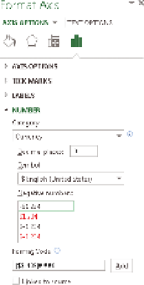
F I g u R e 12 -26
Formatting
a number in Excel
Right-click on the word Europe that appears on the bottom of the chart, then
click Expand/Collapse, and then Expand to CountryName. This will finish the
chart shown at the beginning of this section.
For the first problem, you can put the one series onto a second axis by right-
clicking the series and then selecting Format Data Series. On the screen that
displays, set the axis to Secondary. Notice that some of your data has disap-
peared. To fix this, change the Gap Width to 400% and then go to the other
series and change the Gap Width to 100%. The widths of the two series changes
so that they can always be seen.
Next, right-click the right axis, choose Format Axis, and then change to the Axis
Options tab in the Format Axis pane. Change the Number format to Currency,
check that the correct currency (US$) is chosen, and set the Decimal places to
0. Your setup screen should look like Figure 12-26.
Now, do the same for the axis on the left. In this case, there is one addi-
tional setting you want to set—check the box next to Logarithmic Scale. (See
F i g u r e 12 -27. )
The Logarithmic Scale option sets your axis to show in multiples of 10, which
nicely compresses the data values. It requires some skill on the part of the
reader to know that the values on the two axes scale differently, so be careful
when using this technique.
The chart is as shown in Figure 12-28, but you still have to apply formatting
to make it readable.
F I g u R e 12 -27
Formatting
the secondary axis in Excel