Database Reference
In-Depth Information
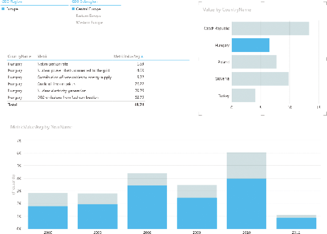
table of data, and column and bar charts interacting with each other. Active
regions are shown in blue, and inactive in a grey-blue.
F I g u R e 12 -18
A Power View dashboard
HTML5
Working in HTML5 gives you the ability to build your own visualizations.
The prism map referenced earlier is one example, but all the other examples
previously listed are possible—with an additional amount of work, of course.
Figure 12-19 shows a heatmap chart built using the InfoVis toolkit. InfoVis is an
open source HTML5 library available at
http://philogb.github.com/jit/
.
The chart in the figure is based on countries for which we have both National
Reserves and GDP per capita in 2009.