Database Reference
In-Depth Information
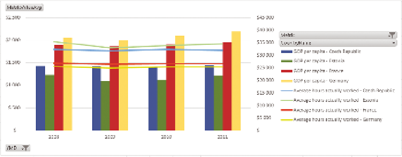
F I g u R e 11 -2 0
An Excel combined graph
The setup screen for the trendline is shown in Figure 11-21, and the resultant
chart is shown in Figure 22.
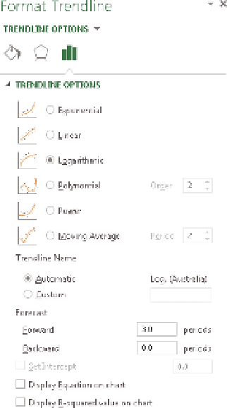
Trendlines can be calculated by various methods:
uu
Exponential:
Showing a curved line, this trendline is useful
when data values rise or fall at constantly increasing rates.
uu
Linear:
Use this type of trendline to create a best-fit straight
line for simple linear data sets. A linear trendline usually shows
that something is increasing or decreasing at a steady rate.
uu
Logarithmic:
A best-fit curved line, this trendline is useful
when the rate of change in the data increases or decreases
quickly and then levels out.
uu
Polynomial:
This trendline is useful when your data fluctuates
as happens, for example, when you analyze gains and losses
over a large data set.
uu
Power:
Showing a curved line, this trendline is useful for data
sets that compare measurements that increase at a specific
rate.
uu
Moving average:
This trendline evens out fluctuations in
data to show a pattern or trend more clearly. A moving aver-
age uses a specific number of data points (set by the Period
option), averages them, and uses the average value as a point
in the line
F I g u R e 11 -21
Trendline options