Database Reference
In-Depth Information
Ease of Development
rEPorTING TooL
PrEDEFINED CHArT TyPE
EASE oF DEVELoPMENT
Excel
Yes
PerformancePoint
Yes
Power View
Yes
Reporting Services
Yes
Silverlight/HTML5
N/A
CoMBINED CHArTING
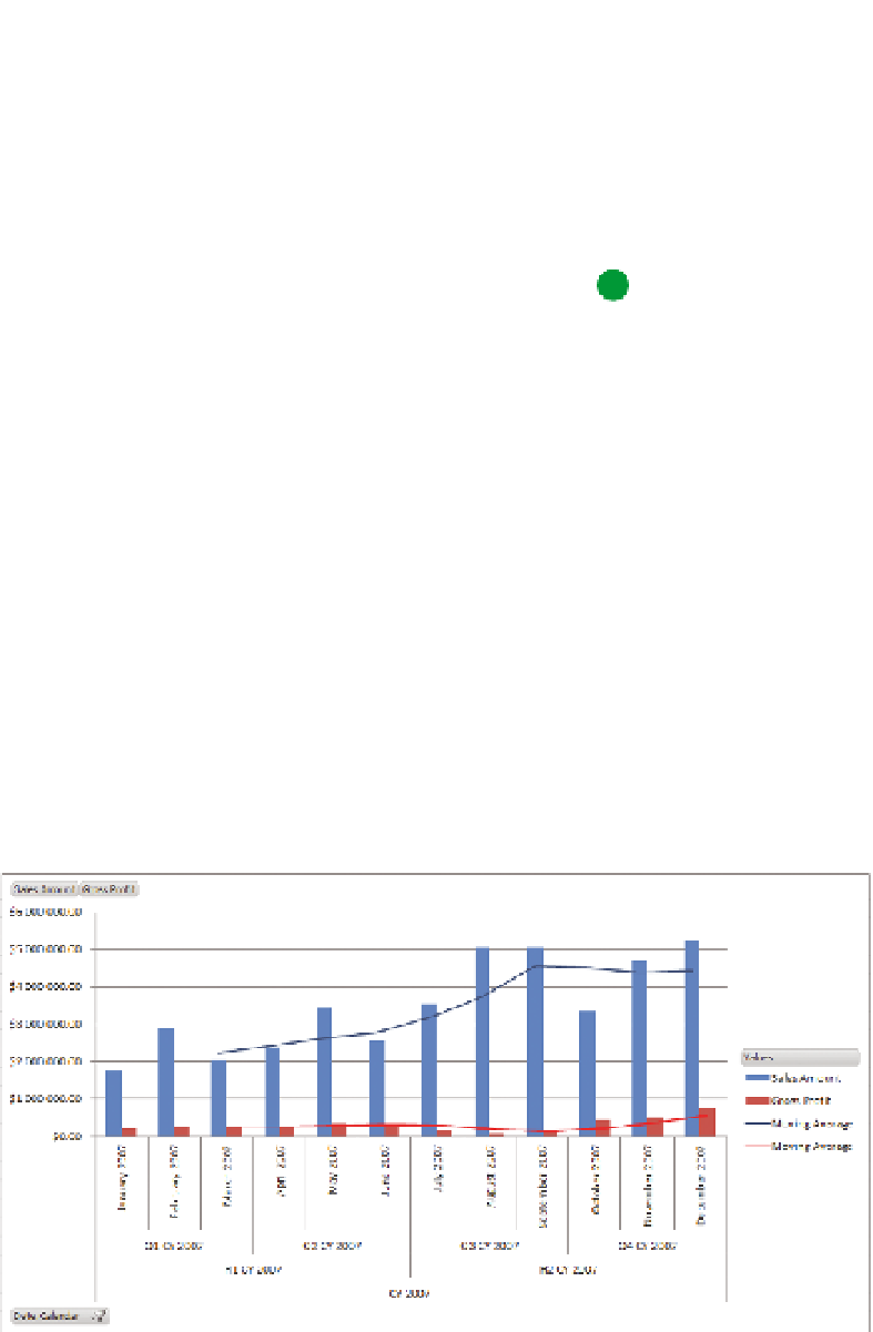
Using a line chart in combination with a column chart is one of the most pow-
erful visualization techniques because it can be used either to show additional
or derived data points, such as profit margin as a percentage against sales
value or profit value, or it can be used to show a trend, such as a three-month
moving average. Choice of color in this combined form is very important; if
you have used multiple series that are differentiated by color, making sure
that the line and the chart for matched series have similar colors is essential.
Using different shades of the same color ensures that contrast is maintained
between the line and the chart while still keeping the relationship clear. An
example of using different shades of red and blue to match Sales Amount and
Gross Profit to their moving averages is shown in Figure 11-5.
FIguRe 11-5
Using matched colors to show relationships between series