Database Reference
In-Depth Information
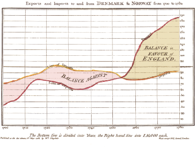
as shown in Figure 11-3. This early example of a line chart by William Playfair
shows a classic use of a line chart—comparing imports and exports over time,
with the area of the chart between the lines being an important additional
data point. Because the imports are additive over time, the overall area enables
you to compare whether for the period as a whole, England has imported or
exported more goods.
F I g u R e 11 - 3
An example of an early line chart by William Playfair
Line charts are one of the most used and most useful chart types. They are
present in almost every reporting tool, and they are used almost exclusively
for showing changes over time. You must take care not to casually interpolate
data between data points if the chart data is not contiguous. As an example,
let's consider a store that trades Monday to Saturday, and is closed on Sundays.
If a chart for the month included Sundays on the axis, it would be misleading
to draw a line from the sales value on Saturday to the sales value on Monday
via Sunday, because the chart would then show a sales value for a day that
the store was closed.
The area chart version of the line chart simply shades in the gaps between
various lines on the chart. However, note that many of the challenges inherent
in attempting to judge area are present in this type of chart.