Information Technology Reference
In-Depth Information
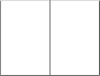
(a) Single layout
(b) Two-column layout
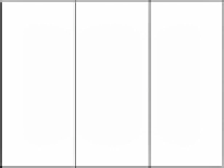
(c) hree-column layout
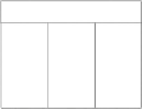
(d) Matrix layout
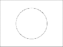
(e) Circular layout
(f ) "T" layout
FIGURE 8.23
Tested layouts.
•
An even number of elements is preferred more than an odd number; ideal is
eight.
•
Images placed symmetrically in the middle look better than on the left/right
of the screen.
•
Free-flow layout is easier to use than grid-based layout.
Results summary.
First, we tested a T-layout option, which started to be widely popular, in our view,
due to its adoption in many favorite websites by the respondents. Therefore, we
split the question into a T-layout and a three-column layout. The largest group of
responses were given to the three-column layout (35%) and the T-layout (15%).
Here, the navigation would be put on top, the most important in the left column, the
less important in middle, and the least important in the right column. Alternatively,
navigation and personal information on the left, images on the right, new information
above the center, important information below the center. Third place (15% each)
came to a two-column layout and central layout. With the former, respondents would
put important information to the left and less important information or images to the
right. The reasons for choosing the latter layout would be aesthetics and originality.
The center would be used for important information or images. (See Figure 8.24(a).)
Czech
Results summary.
The most preferred layout had three columns (45%), followed by both the central
and matrix layouts (20%); two-column layout came third (15%). The three-column
layout was chosen, because it allows placement of the most important information in


Search WWH ::

Custom Search