Geography Reference
In-Depth Information
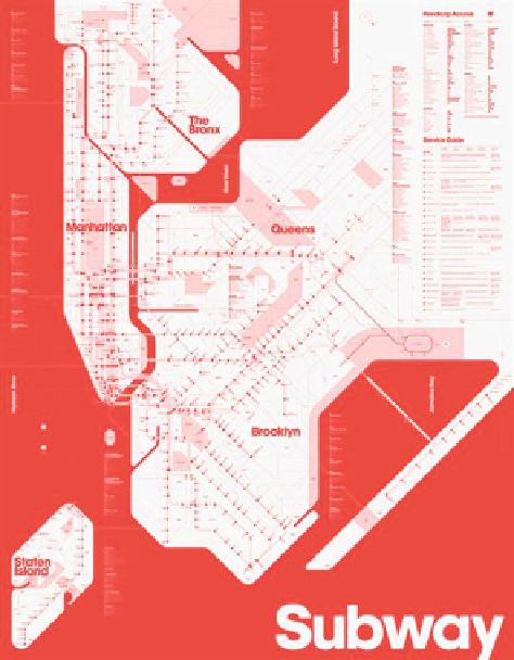
Fig. 1 Triboro design
'
s
New York subway map.
Source
: Heller.
http://www.
choosing unambiguous colour combinations;
using alternative visual variables; and
directly annotating features.
Arditi (
2010
) also proposed three basic rules for better choosing colour schemes
for colour-blind users:
Exaggerate lightness differences between foreground and background colours,
and avoid using colours of similar lightness adjacent to one another, even if they
differ in saturation or hue;
Choose dark colours (with hues from the bottom half of the hue circle shown
below) against light colours from the top half of the circle. Avoid contrasting
light colours from the bottom half against dark colours from the top half.
Avoid contrasting hues from adjacent parts of the hue circle, especially if the
colours do not contrast sharply in lightness.
Light and Bartlein (
2004
) offered three suggestions that might make colour
graphics and maps more accessible to all. These suggestions were:
Avoid the use of spectral schemes to represent sequential data, because the
spectral order of visible light caries no inherent magnitude message;

