Biology Reference
In-Depth Information
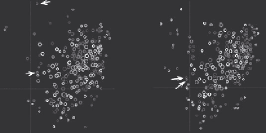
facility over a specific period of time turns out positive for the particular
pathogen (Sarkar et al. 2008). The evolution of the graph over a sequence of
discrete time steps is captured with the Dynamic Social Network in Latent
space method (DSNL) introduced in Sarkar and Moore (2005). DSNL projects
proximity between entities in the graph onto a low-dimensional Euclidean
space so that images of pairs of closely connected entities end up near each
other in the projection. The DSNL optimization algorithm combines the
criterion of the fidelity of the projection with respect to the current graph
topology, and the desire to maintain smooth transitions between projections
computed for subsequent time steps. The results often produce meaningful
visualizations of evolution of complex dynamic networks. Figure 9.7 depicts
two consecutive embeddings of food factories obtained for microbial testing
data collected over years 2005 and 2006. Each circle corresponds to a fac-
tory and its size to the observed frequency of positive results of tests against
Salmonella
. In 2005, factories A and B recorded some isolates, but ended up far
apart in the Euclidean projection of the graph because the sets of serotypes
of
Salmonella
positives found in them were not correlated. Moreover, a rare
strain was found in factory A in 2005, and that pushed it into the periphery
of the distribution of factories. The situation changed in 2006. Both A and B
were then jointly exposed to a relatively popular
Salmonella Muenchen
and
they ended up being projected close to each other and closer to the main-
stream of the distribution of food factories.
It is also possible to use DSNL for link prediction. It then leverages link-
entity-based aggregation of evidence available in historical data, to predict
the probabilities of future occurrences of specific strains of
Salmonella
at spe-
cific food factories. One way to evaluate practical utility of such predictor
is to measure for each factory the fraction of the top k% most likely sero-
types predicted by the model that actually occur there. Table 9.1 presents
2005
A
2006
B
A
B
Figure 9.7
Mapping of the food factories obtained by embedding the bi-partite graph in a two-dimensional
Euclidean space over two consecutive data collection cycles.