Graphics Programs Reference
In-Depth Information
Step Eight:
Now that we're on a gray background,
rather than black, you can see that this
Exif Metadata template actually has a
drop shadow on the image included in
the design, but of course you can't see it
when you're on a solid black background
(which makes you wonder why Adobe
had that feature turned on in the first
place, eh?). Anyway, you can control the
size, opacity, and direction of the drop
shadow (see page 312 for more on drop
shadows) in the Options panel, but for
now we'll just increase the Radius to
soften the shadow and lower the Opacity
a bit to give us the look you see here.
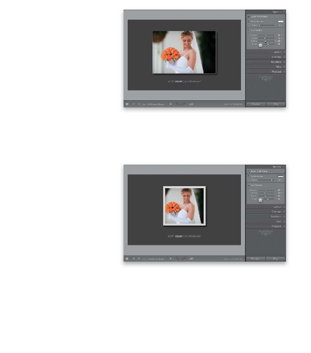
Step Nine:
Let's give this layout a little more of a fine
art slide show feel by making the image
area square. It's not real obvious how to
do this, but luckily it's fairly easy. You
start by moving the guides, so they make
a square. This makes perfect sense at first,
but once you see that it just resizes your
photo, at the same aspect ratio, inside
that square cell (rather than cropping it
to square), you start scratching your head
(well, I did anyway, but it was only be-
cause my head was itchy. That was pretty
bad. I know). The trick is to go up to the
Options panel and turn on the checkbox
for Zoom to Fill Frame. That fills the square
cell with your image, and now you get the
square look you see here. While we're here,
let's go and add a thicker stroke around
the image using the Stroke Border Width
slider in that same panel (more on adding
a stroke on page 312).