Graphics Programs Reference
In-Depth Information
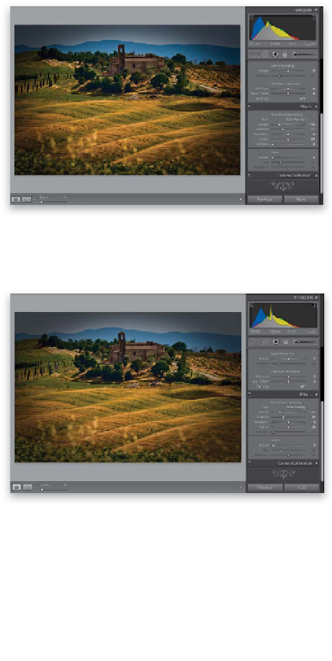
Step Five:
The Color Priority style is more concerned
with keeping your color accurate around
the edges, so the edges do get a bit darker,
but the colors don't get more saturated
(as seen here—the edges also aren't as dark
as the ones you saw in Step Four). Color
Priority isn't a bad choice. It's a little more
subtle in most cases (even when using
the same Amount setting), and I think
it's also better than the old Lightroom 2
post-crop look.
Step Six:
And finally Paint Overlay, seen here,
gives you the same look we had back
in Lightroom 2 for post-crop vignetting,
which just painted the edges dark gray.
I don't think this looks nearly as good
(or realistic) as the other choices, which
is why I don't use Paint Overlay at all
(yeech!). Okay, so that's the styles thing.
The Post-Crop Vignetting Amount and
Midpoint sliders do the same thing as
the standard Lens Vignetting feature
(the Amount controls how dark the edges
get, and the Midpoint determines how
far in the darkening goes). Even though
we've cropped the image in tight, when
you drag the Amount slider over to the
left quite a bit, and the Midpoint slider
to the left a little bit, you can see
the results.
Continued