Graphics Programs Reference
In-Depth Information
Photos that have rich, vibrant colors definitely have their appeal (that's why
professional landscape photographers got so hooked on Velvia film and its
trademark saturated color), and although Lightroom has a Saturation slider for
increasing your photo's color saturation, the problem is it increases all the colors
in your photo equally—while the dull colors do get more saturated, the colors
that are already saturated get even more so, and well…things get pretty horsey,
pretty fast. That's why Lightroom's Vibrance control may become your Velvia.
More Vibrant
Step One:
In the Presence section (at the bottom of
the Basic panel) are two controls that affect
the color saturation. I avoid the Saturation
slider for the reasons mentioned above—
everything gets saturated at the same
intensity (it's a very coarse adjustment).
If you click-and-drag the Saturation slider
to the right, your photo does get more
colorful, but in a clownish, unrealistic kind
of way (the over-saturation won't show up
here in the printed book because the photos
here get converted to CMYK for a printing
press, so I'm just showing the original photo
here, untouched). But, go ahead and try it
yourself—drag the Saturation slider to the
far right and you'll see what I mean. Now,
return the Saturation amount back to 0.
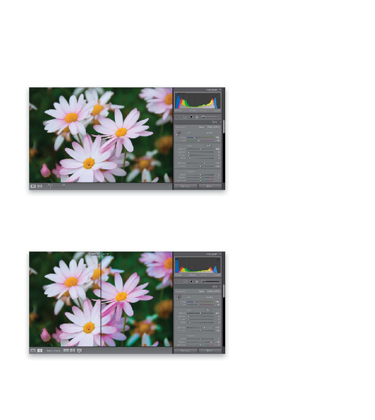
Step Two:
Now try the Vibrance slider—it affects
dull colors the most (like the pink flowers),
and it affects already saturated colors the
least (like the yellow capitulum and the
grass behind them), and lastly, it does try
to avoid affecting fleshtones as much as
possible (which doesn't come into play in
this particular photo). This gives a much
more realistic-looking color saturation
across the board, without trashing your
skin tones, which makes this a much more
usable tool. Here's the same photo using
the Vibrance slider instead. The petals look
much more vibrant, but without looking
“clowny” (I bet that word throws my spell
checker for a loop). So, unless I'm desatu-
rating an overly colorful photo, I pretty
much avoid the Saturation slider altogether.