HTML and CSS Reference
In-Depth Information
Name
Description
:active
Refers to any element that has been activated by user input—e.g., a hyperlink on which a user
clicks during the time the mouse button is held down.
As with
:link
and
:visited
, these pseudo-classes are most familiar in the context of
hyperlinks. Many web pages have styles that look like this:
a:link {color: navy;}
a:visited {color: gray;}
a:hover {color: red;}
a:active {color: yellow;}
:active
is analogous to the
alink
attribute in HTML 3.2, although, as before, you can
apply color changes and any style you like to active links.
The order of the pseudo-classes is more important than it might seem
at first. The usual recommendation is “link-visited-hover-active,” al-
though this has been modified to “link-visited-focus-hover-active.” The
next chapter explains why this particular ordering is important and dis-
cusses several reasons you might choose to change or even ignore the
recommended ordering.
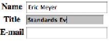
Notice that the dynamic pseudo-classes can be applied to any element, which is good
since it's often useful to apply dynamic styles to elements that aren't links. For example,
using this markup:
input:focus {background: silver; font-weight: bold;}
…you could highlight a form element that is ready to accept keyboard input, as shown
in
Figure 1-36
.
Figure 1-36. Highlighting a form element that has focus
You can also perform some rather odd feats by applying dynamic pseudo-classes to
arbitrary elements. You might decide to give users a “highlight” effect by way of the
following:
body *:hover {background: yellow;}
This rule will cause any element that's descended from the
body
element to display a
yellow background when it's in a hover state. Headings, paragraphs, lists, tables, im-
ages, and anything else found inside the
body
will be changed to have a yellow