Database Reference
In-Depth Information
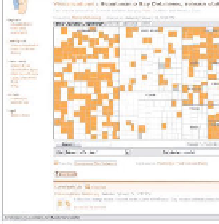
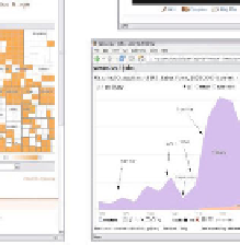
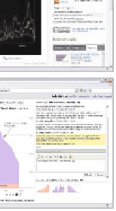
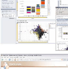
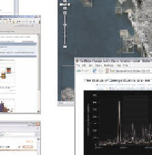
Fig. 2.
Asynchronous Collaborative Visualization Systems. Clockwise from top-left:
Spotfire DecisionSite Posters, Wikimapia, Swivel, sense.us, and Many Eyes.
to create comments with pointers into the visualization provides an easy way to
choreograph a step-by-step presentation.
Swivel: Sharing Data on the Web:
Swivel.com is a web site that supports
sharing and discussion around data. The service appears to be modeled on sites
such as YouTube that support sharing of other media. In keeping with this
model, Swivel allows users to upload data sets and talk about them in attached
discussion forums. In addition, the site automatically generates graphs by com-
bining columns from uploaded data sets into bar charts, pie charts, and scatter
plots. Pointing behavior on the site appears limited.
Although the graphs on Swivel are not interactive, the site provides an exam-
ple of social data analysis in action, in particular the importance of collaborative
publishing and sharing of visualizations. While there do not seem to be many
extensive conversations in Swivel's discussion area there has been significant use
of Swivel's graphs among bloggers to discuss statistics. In other words, it appears
that the ability to publish graphs for use in other contexts is most valuable to
Swivel's users.
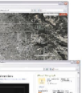
Wikimapia: Collaborative Geographic Annotation:
Wikimapia.org is a
web site enabling collective annotation of geographic satellite imagery, and is
representative of similar efforts such as Google Earth and mash-ups created with
web APIs to mapping services. The site provides a zoomable browser of satellite

Search WWH ::

Custom Search