HTML and CSS Reference
In-Depth Information
In theory, one “em” is equal to the width of a lowercase “m” in the font used—that's
where the name comes from, in fact. It's an old typographer's term. However, this is
not assured in CSS.
ex
, on the other hand, refers to the height of a lowercase
x
in the font being used.
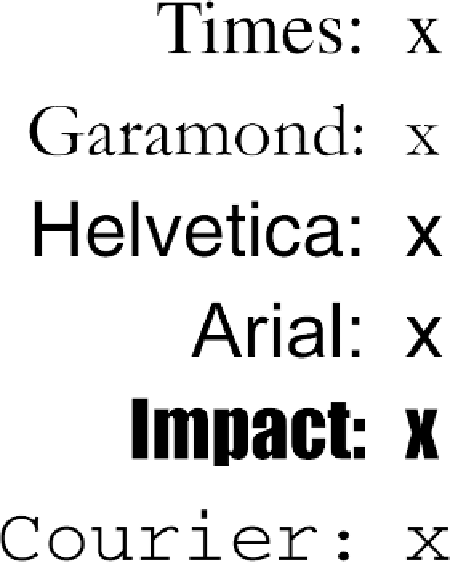
Therefore, if you have two paragraphs in which the text is 24 points in size, but each
paragraph uses a different font, then the value of
ex
could be different for each para-
graph. This is because different fonts have different heights for
x
, as you can see in
Figure 4
. Even though the examples use 24-point text—and therefore, each example's
em
value is 24 points—the x-height for each is different.
Figure 4. Varying x-heights
The rem unit
Like the
em
unit, the
rem
unit is based on declared font size. The difference—and it's a
doozy—is that whereas
em
is calculated using the font size of the element to which it's
applied,
rem
is
always
calculated using the root element. In HTML, that's the
html
element. Thus, declaring any element to have
font-size: 1rem;
is setting it to have the
same font-size value as the root element of the document.