Database Reference
In-Depth Information
17. Click on
OK
to save the changes.
18. Click on one of the months along the x axis, and select
Horizontal Axis
Properties…
to bring up the
Horizontal Axis Properties
window.
19. In the
Axis Options
tab, change the value for
Interval
from
Auto
to
1
and
click on
OK
. This will force every month value to be displayed on the x axis.
20. Right-click on a blank space in the chart and select
Chart Properties…
to
bring up the
Chart Properties
window.
21. In the
Border
tab, click on the button above
None
in the
Presets
section and
click on
OK
to remove the border from the chart.
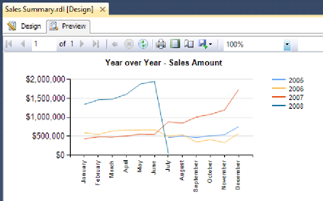
22. At the top of the report canvas, click on the
Preview
tab (to the right of the
Design
tab) to run the report within SQL Server Data Tools. Your report
should resemble the one in the following screenshot: