Database Reference
In-Depth Information
Creating column charts
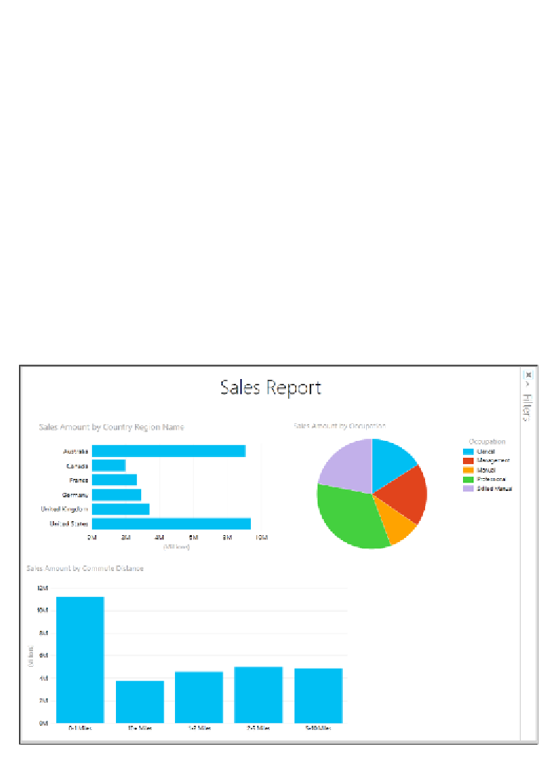
The next object we will add to the Power View report is a column chart comparing
Sales Amount
by
Customer Commute Distance
. Follow these steps:
1.
Click on a blank space on the canvas.
2.
In the
Field List
, locate and expand the
Internet Sales
table.
3.
Click the checkbox next to the
Sales Amount
field.
4.
Move the object to the lower-left corner of the canvas—just below the
bar chart.
5.
Now locate and expand the
Customer
table in the
Field List
, and click on the
checkbox next to
Commute Distance
.
6.
With the new object still in focus, click on the
Column
button in the
visualizations group of the ribbon.
7.
Just as with the bar chart and pie chart from the previous sections, click
on, and hold the bottom-right corner of the column chart object and drag it
out towards the bottom-right corner of the screen to increase the size. Your
report canvas should now resemble the following screenshot:
Column chart added to bottom-left corner of report body