Database Reference
In-Depth Information
Challenge step!
9)
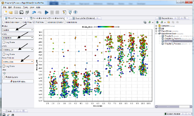
While still in results perspective, click on the ExampleSet tab (which exists assuming you
left the
exa
port connected to a
res
port when you were in design perspective). Click on the
Plot View radio button. Examine correlations that you found in your model visually by
creating a scatter plot of your data. Choose one attribute for your x-Axis and a correlated
one for your y-Axis. Experiment with the
Jitter
slide bar. What is it doing? (Hint: Try an
Internet search on the term 'jittering statistics'.) For an additional visual experience, try a
Scatter 3D or Scatter 3D Color plot. Consider Figures 4-8 and 4-9 as examples. Note that
with 3D plots in RapidMiner, you can click and hold to rotate your plot in order to better
see the interactions between the data.
Figure 4-8. A two-dimensional scatterplot with a
colored third dimension and a slight jitter.