HTML and CSS Reference
In-Depth Information
Listing 5.3. Liquid-Width, Two-Column Layout, Sidebar on Right
#Content {
float: left;
width: 80%;
}
#Pages {
float: right;
width: 18%;
}
In this case, because the sidebar follows the content in the text, rather than merely on the screen, you actually
don't need the extra rule for IE.
Three Columns, Sidebar on Left and Right
Three-column layouts are trickier. In fact, they're so tricky that it took many smart people quite a few years of
experimentation to develop the technique I show here. In fact, so many people searched for this while believing
that it didn't actually exist that this technique goes under the name "The Holy Grail." The goal is simple: two
fixed-width columns on the left and right and a liquid center for the content in the middle. (That something so
frequently needed was so hard to invent doesn't speak well of CSS as a language, but it is the language we
have to work with.)
Listing 5.4
demonstrates a typical three-column HTML layout. Now there are three
div
s:
Pages
,
Content
, and
Books
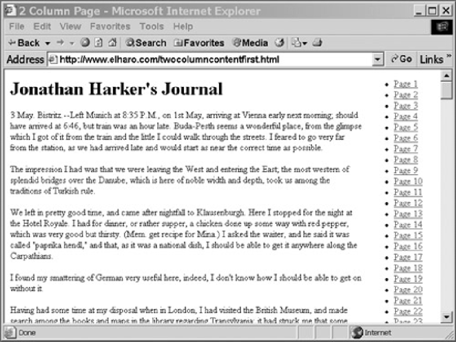
. The main content contains the first page from
Dracula.
The left-hand column contains links to other
pages in this topic. The right-hand column contains links to other topics. Once again, the content comes first.


Search WWH ::

Custom Search