Database Reference
In-Depth Information
7.
Sort for comprehension.
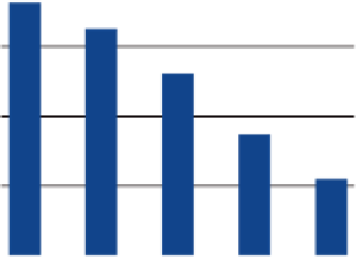
Add structure and clarity to the chart by sort-
ing by a metric of interest. Users want to see what values are largest or
smallest. They shouldn't have to hunt through a chart to find this basic
information, as shown in Figure 5-31.
BAD
GOOD
Unit Sales by Fruit
Unit Sales by Fruit
80
80
60
60
40
40
20
20
Apples
Bananas
Blue-
berries
Oranges
Pears
Apples
Pears
Oranges
Blue-
berries
Bananas
Figure 5-31:
Sort columns to make it easy to find the interesting insights.
8.
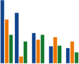
use color variants.
If you are displaying multicolumn or stacked charts,
use variants on a hue or gray to show different data series. This approach
reduces the need for a wide variety of distracting colors, as shown in
Figure 5-32.
BAD
GOOD
Unit Sales by Fruit
Unit Sales by Fruit
80
80
60
60
40
40
20
20
Apples Bananas
Blue-
berries
Oranges
Pears
Apples Bananas
Blue-
berries
Oranges
Pears
Figure 5-32:
Fewer colors can be better.
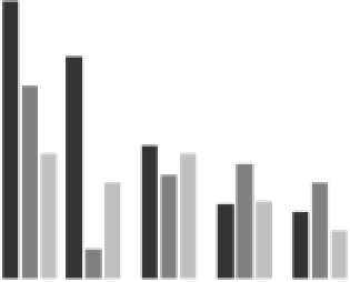
Also, don't vary the colors by point like in the chart in Figure 5-33. This creates
a lot of unnecessary visual noise and makes similar colors seem related.


Search WWH ::

Custom Search