Database Reference
In-Depth Information
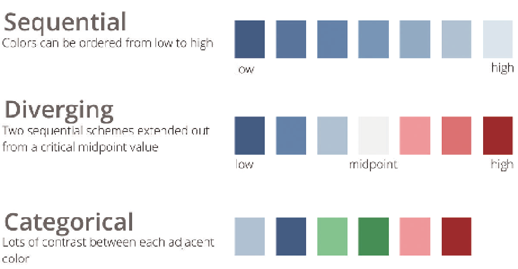
Figure 5-20 provides an example of each of these color schemes.
Figure 5-20:
Color schemes must fit their purpose in a chart
Typography
Typography is an obsession for some; it can include everything from choosing
a typeface to picking the right point size, kerning, tracking, and leading. In the
meantime, you have a data product to produce. This section provides a simple
and useful framework for making decisions that ensure quality typography
in your data displays.
With just few simple decisions, you can ensure that the text on the dashboard
will both look good and communicate effectively. The majority of text on a
page falls into four categories:
Body
text is clean, readable content.
⬛
Headers
separate and name major sections of your work.
⬛
Notes
describe additional things the reader should be aware of. For
the most part these should fade into the background.
⬛
Emphasis
text is what you want your reader to pay particular attention to.
⬛
Search WWH ::

Custom Search