Database Reference
In-Depth Information
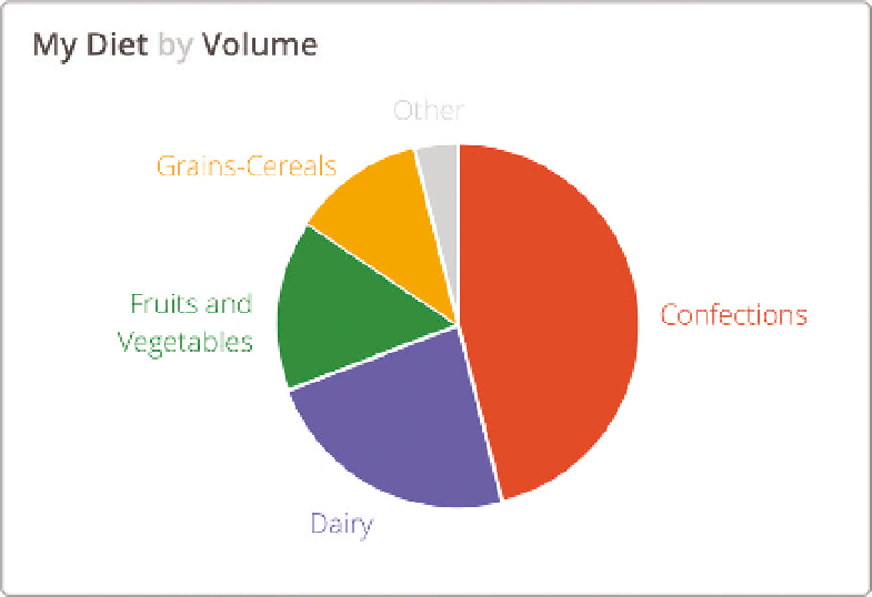
Figure 4-16
My diet by volume
Unexpected Patterns or Relationships
Plotting data in a scatterplot or bubble chart is a way to show relationships
between two or more variables. The pattern of the points may express a cor-
relation that is either expected or surprising. Furthermore, outliers from this
pattern are interesting because they break the mold.
This scatterplot (Figure 4-17) shows animal size versus weight. The data indi-
cates a positive relationship between the size of the animal and its top speed.
Bigger is faster, but with a lot of variation. The cheetah is an outlier with an
unusually high ratio of speed to body mass. It's good to see that humans are
faster than bears. Unfortunately, a detailed reading of the data behind this
chart reveals that the human data point is Usain Bolt, world record holder in
the 100 meter sprint.
5
Unexpected Trends
Trends across time are another common place to look for insights. Line charts
can make obvious deviations apparent when compared to expected patterns
or trends. Like the pie chart, readers need to overlay their assumptions on the
shape of the lines. Do you expect there to be an upward trend? Should the
values remain steady over time, or is it normal to see substantial fluctuations?
Search WWH ::

Custom Search