Game Development Reference
In-Depth Information
You might wonder why there's no arrow pointing to the right. Remember from Chapter 8 that,
with our fancy sprite batcher, we can easily flip things we draw by specifying negative width
and/or height values. We'll use that trick for a couple of graphical assets to save some memory.
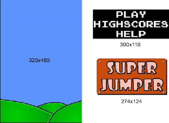
Next up are the elements we need on the main menu screen: a logo, the menu entries, and the
background image. Figure
9-5
shows all those elements.
Figure 9-5.
The background image, the main menu entries, and the logo
The background image is used not only on the main menu screen, but on all screens. It is the
same size as our target resolution, 320×480 pixels. The main menu entries make up
300×110 pixels. The main menu's black background is used because white on white wouldn't
look good. In the actual image, the main menu's background is made up of transparent pixels,
of course. The logo is 274×142 pixels with some transparent pixels at the corners.
Next up are the help screen images. Instead of compositing each of them with a couple of
elements, we lazily made them all full-screen images of size 320×480. That will reduce the size
of our drawing code a little while not adding a lot to our program's size. You can see all of the
help screens in Figure
9-2
. The only thing we'll composite these images with is the arrow button.
For the high-scores screen, we'll reuse the portion of the main menu image that says
HIGHSCORES. The actual scores are rendered with a special technique we'll look into later in
this chapter. The rest of that screen is again composed of the background image and a button.
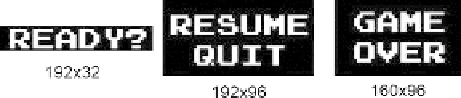
The game screen has a few more textual UI elements, namely the READY? label, the menu
entries for the paused state (RESUME and QUIT), and the GAME OVER label. Figure
9-6
shows
them in all their glory.
Figure 9-6.
The READY?, RESUME, QUIT, and GAME OVER labels