HTML and CSS Reference
In-Depth Information
Check Boxes
Check boxes are very similar to radio buttons. They use the same attributes and patterns,
with the exception of
checkbox
as their
type
attribute value. The difference between
the two is that check boxes allow users to select multiple values and tie them all to one
control name, while radio buttons limit users to one value.
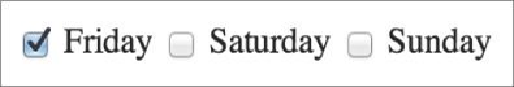
1.
<input
type="checkbox"
name="day" value="Friday" checked> Friday
2.
<input
type="checkbox"
name="day" value="Saturday"> Saturday
3.
<input
type="checkbox"
name="day" value="Sunday"> Sunday
Figure 10.10
A group of check boxes created using the
<input>
element with a
type
attribute value of
checkbox
Drop-Down Lists
Drop-down lists are a perfect way to provide users with a long list of options in a practical
manner. A long column of radio buttons next to a list of different options is not only visu-
ally unappealing, it's daunting and difficult for users to comprehend, especially those on a
mobile device. Drop-down lists, on the other hand, provide the perfect format for a long
list of choices.
To create a drop-down list we'll use the
<select>
and
<option>
elements. The
<se-
lect>
element wraps all of the menu options, and each menu option is marked up using
the
<option>
element.
The
name
attribute resides on the
<select>
element, and the
value
attribute resides
on the
<option>
elements that are nested within the
<select>
element. The
value
attribute on each
<option>
element then corresponds to the
name
attribute on the
<se-
lect>
element.
Each
<option>
element wraps the text (which is visible to users) of an individual option
within the list.
Much like the
checked
Boolean attribute for radio buttons and check boxes, drop-down
menus can use the
selected
Boolean attribute to preselect an option for users.
Search WWH ::

Custom Search