Database Reference
In-Depth Information
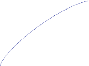
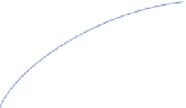
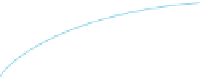
Fig. 13.5
Frequency vs.
G-test score
1
2
.2
1.8
1
.35
0.8
0
.899
0
.449
0.6
0.4
0.449
0
.899
1
.35
1
.8
2.
7
0.2
0
0
0.2
0.4
0.6
0.8
1
p (positive frequency)
dataset,
i.e.
,
p
(
g
), while the Y axis is the frequency of the same subgraph in the
negative dataset,
q
(
g
). The curves depict G-test score. Left upper corner and right
lower corner have the higher G-test scores. The “circle” marks the highest G-score
subgraph discovered in this dataset. As one can see, its positive frequency is higher
than most of subgraphs.
[Frequency Association]
Significant patterns often fall into the high-quantile of
frequency.
To profit from frequency association, an iterative frequency-descending mining
method is proposed in [
50
]. Rather than performing mining with very low frequency,
the method starts the mining process with high frequency threshold
θ
1
.
0, cal-
culates an optimal pattern candidate
g
whose frequency is at least
θ
, and then
repeatedly lowers down
θ
to check whether
g
can be improved further. Here, the
search leaps in the frequency domain, by leveling down the minimum frequency
threshold exponentially.
=